Here’s a sobering statistic: the average landing page conversion rate across industries hovers around just 2.35%.
Yet the top 25% of landing pages are converting at 5.31% or higher, with the top 10% achieving conversion rates of 11.45% and above. What separates these high performers from the rest?
The answer lies not in luck or massive advertising budgets, but in understanding and implementing the fundamental principles that make a good landing page. Whether you’re launching your first campaign or looking to optimize existing pages, mastering these elements can mean the difference between burning through your marketing budget and building a profitable conversion machine.
What Exactly Is a Landing Page?
Before diving into optimization strategies, let’s clarify what sets a landing page apart from your typical website page. A landing page is a standalone web page created specifically for a marketing or advertising campaign. It’s where a visitor “lands” after clicking on a link in an email, ad, or other digital location.
Unlike your homepage, which typically encourages exploration and serves multiple audiences, a landing page has one focused objective: converting visitors into leads or customers. This singular focus is what makes landing pages so powerful—and why they convert 2-5 times better than standard website pages when done correctly.
Think of it this way: your homepage is like a department store entrance, offering multiple paths and options. A landing page is more like a specialized boutique with one amazing product on display and a clear invitation to buy.
The Anatomy of a High-Converting Landing Page
1. Headlines That Stop Visitors in Their Tracks
You have approximately 8 seconds to capture a visitor’s attention before they decide whether to stay or leave. Your headline is your first and most crucial opportunity to make that connection. A compelling headline doesn’t just describe what you offer—it promises a transformation or solution to a pressing problem.
The best headlines follow these principles:
- Clarity over cleverness: “Increase Your Email Open Rates by 47%” beats “Revolutionize Your Inbox Game”
- Specific benefits: Include numbers, timeframes, or specific outcomes when possible
- Emotional resonance: Address the visitor’s pain points or desires directly
- Match the ad promise: Ensure consistency between your ad copy and landing page headline to maintain message match
Pro tip: Test your headline by asking yourself, “Would I stop scrolling for this?” If the answer isn’t an immediate yes, keep refining.
2. CTAs That Compel Action
Your call-to-action (CTA) button is where desire transforms into action. Yet surprisingly, 70% of small business websites lack a clear CTA on their landing pages [Source: Small Business Trends 2024]. This oversight is costing them countless conversions.
An effective CTA follows the CLICK framework:
- Clear: Use action-oriented language (“Start Your Free Trial” not “Submit”)
- Location: Place above the fold and repeat after key benefit sections
- Irresistible: Create urgency or highlight value (“Get Instant Access”)
- Contrasting: Use colors that stand out from the page design
- Knowledge: Tell visitors exactly what happens next
But what if your audience isn’t responding to traditional CTAs? Consider testing first-person language (“Start My Free Trial” vs. “Start Your Free Trial”). Research from Unbounce shows this simple change can increase click-through rates by up to 90% in some industries.
3. Benefit-Focused Copy That Sells
Features tell, but benefits sell. Your landing page copy should focus relentlessly on what your visitor will gain, not just what you offer. Transform every feature into a benefit by asking, “So what?” until you reach the emotional core of why someone should care.
For example:
- Feature: “256-bit SSL encryption”
- So what?: “Your data is protected”
- So what?: “You can shop without worrying about identity theft”
- Benefit: “Shop with complete peace of mind knowing your personal information is safer than Fort Knox”
Structure your copy using the AIDA model:
- Attention: Grab focus with your headline
- Interest: Build curiosity with compelling benefits
- Desire: Create want through social proof and urgency
- Action: Direct them to your CTA
4. Trust Signals and Social Proof
In an era where 88% of consumers trust online reviews as much as personal recommendations [Source: BrightLocal 2024], social proof isn’t optional—it’s essential. Your landing page needs to quickly establish credibility and reduce the perceived risk of taking action.
Effective trust signals include:
- Customer testimonials: Use specific, results-focused testimonials with full names and photos when possible
- Client logos: Display recognizable brands you’ve worked with
- Statistics: “Join 50,000+ marketers who trust our platform”
- Security badges: SSL certificates, payment security logos, privacy certifications
- Guarantees: Money-back guarantees, free trials, or satisfaction promises
- Media mentions: “As featured in…” with publication logos
5. Optimized Forms That Don’t Scare Away Leads
Every additional form field you add reduces conversions by an average of 4.5% [Source: Marketo 2024 Study]. The key is finding the sweet spot between gathering necessary information and minimizing friction.
Form optimization best practices:
- Minimize fields: Ask only for essential information initially
- Use smart defaults: Pre-fill information when possible
- Single-column layout: Easier to scan and complete
- Inline validation: Show errors immediately, not after submission
- Progress indicators: For multi-step forms, show how many steps remain
- Benefit reminders: Near the submit button, remind visitors what they’ll receive
6. Visual Hierarchy and Design Principles
Good landing page design isn’t about being pretty—it’s about guiding the visitor’s eye toward your conversion goal. Every element should serve a purpose in your conversion funnel.
Key design principles for landing pages:
- F-pattern reading: Place important elements along the natural eye path
- White space: Give elements room to breathe and reduce cognitive load
- Directional cues: Use arrows, eye gaze in images, or visual flow to guide attention to CTAs
- Consistent styling: Maintain visual consistency to build trust
- High-quality images: Use professional photos or illustrations that support your message
7. Mobile Responsiveness
With 58% of all web traffic coming from mobile devices [Source: Statista 2024], a mobile-optimized landing page isn’t a nice-to-have—it’s a necessity. Mobile users have different needs and behaviors than desktop users, and your page must adapt accordingly.
Mobile optimization checklist:
- Thumb-friendly CTA buttons (minimum 44×44 pixels)
- Simplified navigation and shorter forms
- Faster load times (aim for under 3 seconds)
- Readable text without zooming (16px minimum font size)
- Click-to-call buttons for immediate contact
8. Page Load Speed
A one-second delay in page load time can result in a 7% reduction in conversions [Source: Google 2024]. Speed isn’t just a ranking factor—it directly impacts your bottom line.
Speed optimization tactics:
- Compress images without sacrificing quality
- Minimize HTTP requests
- Enable browser caching
- Use a content delivery network (CDN)
- Eliminate render-blocking JavaScript
The Psychology Behind Effective Landing Pages
Cognitive Load Reduction
Every decision requires mental energy. The more choices and information you present, the harder it becomes for visitors to take action. This is why the most effective landing pages embrace simplicity and focus.
Reduce cognitive load by:
- Removing navigation menus that could lead visitors away
- Using bullet points instead of paragraphs
- Highlighting one primary action
- Breaking complex processes into smaller steps
Urgency and Scarcity Principles
Creating a sense of urgency or scarcity can increase conversions by up to 332% when done authentically. However, false scarcity will damage trust and brand reputation.
Ethical urgency tactics:
- Limited-time offers with real deadlines
- Stock levels for physical products
- Enrollment periods for courses or programs
- Early-bird pricing with clear end dates
Color Psychology for CTAs
While there’s no universally “best” button color, understanding color psychology can inform your testing strategy:
- Red: Creates urgency, excitement (great for limited offers)
- Green: Associated with “go,” growth, positivity
- Orange: Energetic, attention-grabbing without being aggressive
- Blue: Trust, security (ideal for financial services)
The key is contrast—your CTA should stand out from the rest of your page design.
Common Landing Page Mistakes to Avoid
1. Message Mismatch
Problem: Your ad promises one thing, but your landing page delivers another.
Solution: Ensure perfect alignment between ad copy, visuals, and landing page content. If your ad mentions a “50% discount,” those exact words should appear prominently on your landing page.
2. Too Many Options
Problem: Multiple CTAs, links, and choices create decision paralysis.
Solution: Follow the “one page, one purpose” rule. Remove all navigation and links that don’t support your primary conversion goal.
3. Weak or Generic Headlines
Problem: Vague headlines like “Welcome” or “Learn More” fail to communicate value.
Solution: Lead with your strongest benefit and make it specific. “Reduce Customer Churn by 40% in 30 Days” beats “Improve Customer Retention.”
4. Ignoring Mobile Users
Problem: Desktop-only design alienates over half your potential audience.
Solution: Design mobile-first, then enhance for desktop. Test your pages on actual devices, not just browser emulators.
5. Slow Load Times
Problem: Heavy images and scripts cause visitors to abandon before the page loads.
Solution: Optimize all media, use lazy loading, and regularly test page speed with tools like Google PageSpeed Insights.
6. Lack of Social Proof
Problem: No evidence that others have succeeded with your offer.
Solution: Add testimonials, reviews, case studies, or user statistics. Even “Join 500+ happy customers” is better than nothing.
7. Complicated Forms
Problem: Asking for too much information upfront.
Solution: Start with just email, or use progressive profiling to gather more information over time.
Industry-Specific Best Practices
SaaS Landing Pages
Software companies face unique challenges in communicating complex value propositions simply. Successful SaaS landing pages often feature:
- Interactive product demos or video walkthroughs
- Free trial offers with no credit card required
- ROI calculators showing potential savings
- Integration logos showing compatibility with existing tools
Example: Slack’s landing page succeeds by leading with a clear value proposition (“Where work happens”), showing recognizable client logos, and offering an immediate free trial with just an email address.
E-commerce Landing Pages
Online retailers need to build trust quickly and overcome the inability to physically examine products:
- High-resolution product images from multiple angles
- Customer reviews and ratings prominently displayed
- Clear return policies and guarantees
- Urgency elements like limited stock indicators
Example: Amazon’s product pages excel with comprehensive image galleries, detailed specifications, customer Q&As, and prominent review sections that address every potential concern.
Service-Based Business Landing Pages
Service providers must overcome the intangibility of their offerings:
- Before/after case studies with specific results
- Detailed service process explanations
- Professional certifications and credentials
- Free consultations or assessments as low-commitment entry points
Testing and Optimization
A/B Testing Fundamentals
The difference between good and great landing pages often comes down to continuous testing and refinement. Even small changes can yield significant results—changing button color alone has been shown to increase conversions by up to 21% in some cases.
Elements to test (in order of typical impact):
- Headlines and value propositions
- CTA button text and placement
- Form length and fields
- Images and videos
- Social proof placement and type
- Page layout and design
Testing best practices:
- Test one element at a time for clear results
- Run tests for statistical significance (usually 1-2 weeks minimum)
- Document all tests and results for future reference
- Test during typical traffic periods, not anomalies
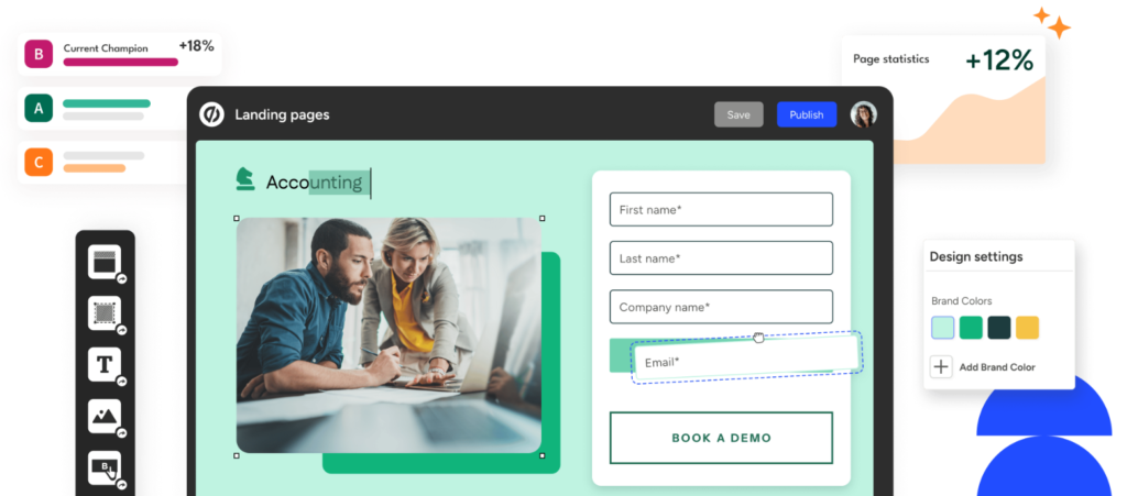
If you’re serious about optimization, consider using a dedicated landing page platform like Unbounce, which offers built-in A/B testing tools and AI-powered optimization suggestions that can accelerate your testing process.
Key Metrics to Track
You can’t improve what you don’t measure. Focus on these essential metrics:
- Conversion Rate: The percentage of visitors who complete your desired action
- Bounce Rate: Visitors who leave without taking any action
- Time on Page: How long visitors engage with your content
- Form Abandonment Rate: How many start but don’t complete your form
- Cost Per Conversion: Your advertising spend divided by conversions
Real-World Examples of Excellence
Airbnb’s Host Landing Page
Airbnb’s host acquisition page demonstrates landing page best practices perfectly:
- Clear value proposition: “Earn money as an Airbnb host” with potential earnings calculator
- Social proof: Host testimonials and success stories
- Objection handling: Addresses concerns about safety, damage, and time commitment
- Progressive disclosure: Simple initial form with more details gathered later
Shopify’s Free Trial Page
Shopify’s landing page converts visitors into trial users through:
- Risk reversal: “Try Shopify free for 14 days, no credit card required”
- Success stories: Featuring real merchants and their results
- Simplicity: Just an email address to get started
- Trust indicators: “Trusted by over 1,000,000 businesses worldwide”
Quick Wins: 3 Changes You Can Implement Today
Want to see immediate improvements in your landing page performance? Start with these three high-impact changes:
- Clarify Your Headline: Rewrite your main headline to include a specific benefit and number. Instead of “Grow Your Business,” try “Increase Revenue by 30% in 90 Days.”
- Add Urgency to Your CTA: Change generic button text like “Submit” or “Learn More” to action-oriented copy with urgency: “Start My Free Trial Now” or “Claim My Spot (Only 10 Left).”
- Reduce Form Fields: Cut your form down to the absolute minimum. If you’re asking for more than name and email for a free resource, you’re likely losing conversions. You can always gather more information later.
Advanced Optimization Strategies
Once you’ve mastered the basics, these advanced tactics can push your conversion rates even higher:
Dynamic Text Replacement
Customize your headline and copy based on the visitor’s search terms or ad they clicked. This hyper-relevance can increase conversions by 30% or more.
Exit-Intent Popups
Capture abandoning visitors with a last-chance offer or lead magnet. When done right, these can recover 10-15% of lost conversions.
Multi-Step Forms
Break longer forms into smaller, less intimidating steps. Start with low-commitment questions and gradually build to higher-commitment fields.
Personalization Based on Traffic Source
Customize messaging for visitors from different channels. LinkedIn traffic might see B2B-focused copy, while Facebook visitors see more casual, benefit-focused messaging.
For those ready to implement these advanced strategies, Unbounce’s free trial includes Smart Traffic technology that automatically sends visitors to the landing page variant most likely to convert them, based on their attributes.
Your Landing Page Checklist
Before launching any landing page, run through this comprehensive checklist:
Essential Elements
- ☐ Compelling headline that matches ad promise
- ☐ Clear, specific value proposition
- ☐ Prominent, contrasting CTA button above the fold
- ☐ Benefit-focused copy (not feature-focused)
- ☐ Social proof (testimonials, reviews, or statistics)
- ☐ Trust signals (security badges, guarantees, certifications)
- ☐ Optimized form with minimal fields
- ☐ Mobile-responsive design
- ☐ Fast load time (under 3 seconds)
- ☐ No distracting navigation links
Optimization Checks
- ☐ A/B test variations set up
- ☐ Tracking pixels installed
- ☐ Thank you page configured
- ☐ Form confirmation emails tested
- ☐ Analytics goals configured
- ☐ Heatmap tracking enabled
Quality Assurance
- ☐ Spell-checked and proofread
- ☐ Links tested and working
- ☐ Forms submitting correctly
- ☐ Images optimized and loading
- ☐ Page tested on multiple devices
- ☐ Cross-browser compatibility verified
Conclusion: Your Next Steps
Creating a good landing page isn’t about following a rigid template—it’s about understanding your audience, clearly communicating value, and systematically removing barriers to conversion. The best landing pages are never truly “done”; they’re constantly evolving through testing and optimization.
Start by auditing your existing landing pages against the principles we’ve covered. Pick your highest-traffic page and implement three improvements this week. Set up at least one A/B test. Most importantly, commit to viewing every landing page as a testing ground for better understanding what motivates your audience to take action.
Remember, even small improvements compound over time. A 2% increase in conversion rate might not seem significant, but for a page receiving 10,000 visitors per month, that’s 200 additional conversions—potentially thousands of dollars in additional revenue.
The difference between good and great landing pages often comes down to the tools and testing capabilities at your disposal. Whether you’re building from scratch or optimizing existing pages, having the right platform can accelerate your success and make testing effortless.
Your landing pages are often the first meaningful interaction potential customers have with your brand. Make them count. Start implementing these strategies today, and watch as your conversion rates—and your business—transform.
For more insights on conversion rate optimization, check out CXL’s comprehensive guide to landing page optimization.
Read more related article:
Unbounce coupon code: Get Upto 35% discount