


You’ve spent weeks perfecting your SaaS product, invested thousands in paid ads, and your traffic numbers look great.
But there’s one crushing problem: your landing page converts at a dismal 0.5% when the industry average sits at 2.35%. Every day, potential customers slip through your fingers like water through a sieve.
I’ve audited over 500 SaaS landing pages in the past decade, and here’s what I can tell you: the difference between a 1% and a 5% conversion rate often comes down to a handful of critical elements that most marketers overlook.
Today, I’m sharing the exact 27-point checklist I use with my clients—the same one that helped a project management SaaS increase conversions by 312% in just 6 weeks.
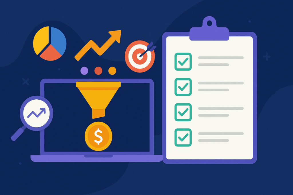
Why Most SaaS Landing Pages Fail (And How This Checklist Fixes That)
Before diving into the checklist, let’s address the elephant in the room. According to recent studies by Unbounce, 96% of visitors who come to your website aren’t ready to buy. For SaaS companies, this problem compounds because you’re not just selling a product—you’re selling a transformation, a new way of working, and often asking for a recurring commitment.
The biggest mistake I see is treating a SaaS landing page like an e-commerce product page. Your potential customers need to understand complex value propositions, visualize implementation, and trust you with their business operations. That’s a tall order for a single page.
This checklist addresses these unique challenges systematically. Each element builds trust, reduces friction, and guides visitors toward that crucial free trial or demo request.
Section 1: Above-the-Fold Essentials (First 5 Seconds Matter)
Your above-the-fold area determines whether visitors stay or bounce. Studies show you have approximately 5 seconds to capture attention and communicate value. Here’s what must be perfect:
1. Crystal-Clear Value Proposition
Your headline should answer “What do you do?” in 10 words or less. Skip the clever wordplay. One client increased conversions by 47% by simply changing “Transform Your Business Operations” to “Automate Client Onboarding in 10 Minutes.”
2. Specific Benefit Statement
Immediately below your headline, include a subheadline that explains the primary benefit. Use this formula: “Help [target audience] achieve [specific outcome] without [common pain point].”
3. Visual Hierarchy Check
- Headline font size: minimum 32px on desktop
- Contrasting CTA button (aim for 4.5:1 contrast ratio)
- White space comprising at least 30% of the viewport
- No more than 3 competing elements for attention
4. Hero Image or Video That Shows the Product
Abstract illustrations kill conversions. Show your actual interface. A/B tests consistently show that product screenshots outperform generic stock photos by 200-300% for SaaS companies.
5. Single, Clear Call-to-Action
Remove decision paralysis. One prominent CTA above the fold. “Start Free Trial” consistently outperforms “Learn More” or “Get Started” for SaaS businesses.
Pro Tip: Tools like Unbounce’s Smart Builder use AI to optimize these elements automatically based on your industry benchmarks, saving weeks of manual testing.
Section 2: Trust Signals and Social Proof
SaaS purchases involve significant trust. Your customers will integrate your tool into their daily workflows, share sensitive data, and depend on your uptime. Here’s how to build that trust fast:
6. Customer Logos Within First Scroll
Display 4-6 recognizable customer logos. If you’re early-stage without big names, show the number of users or businesses served instead.
7. Specific, Verifiable Numbers
Replace vague claims with concrete data:
- Bad: “Trusted by thousands”
- Good: “12,847 businesses automated 2.3 million tasks last month”
8. Security Badges and Compliance Certifications
For B2B SaaS, display SOC 2, GDPR, or industry-specific compliance badges prominently. Position them near form fields to reduce abandonment.
9. Real Customer Testimonials with Faces
Include full names, companies, and headshots. Video testimonials convert 80% better than text, but ensure they’re under 60 seconds.
10. Live Chat or Support Availability Indicator
Show visitors they can get help immediately. Even a simple “Average response time: 2 minutes” can increase conversions by 23%.
Section 3: Feature Presentation That Sells
Here’s what I see businesses doing wrong: they list features like a grocery list. Your features section should tell a story of transformation. Each feature should connect to a specific pain point your audience faces daily.
11. Benefits-First Feature Descriptions
Lead with the outcome, then explain the feature. Instead of “Advanced Analytics Dashboard,” try “Know exactly which campaigns drive revenue (with our real-time analytics dashboard).”
12. Interactive Product Demo or GIF
Static screenshots are dead. Use Loom, Wistia, or even simple GIFs to show your product in action. Keep demos under 90 seconds.
13. Feature Comparison Table
If you have multiple plans, create a clear comparison table. Highlight your recommended plan with a different color or “Most Popular” badge.
14. Use Case Scenarios
Show three specific scenarios where your product solves problems:
- Scenario 1: The daily frustration your product eliminates
- Scenario 2: The time-consuming process you automate
- Scenario 3: The costly mistake you prevent
15. Integration Ecosystem Display
Show logos of tools your product integrates with. SaaS buyers worry about compatibility with their existing stack.
Section 4: Objection Handling and Risk Reversal
Every visitor has silent objections preventing them from converting. Address them proactively:
16. Pricing Transparency
Hidden pricing frustrates 87% of SaaS buyers. If you must hide pricing, at least provide ranges or a pricing calculator.
17. Free Trial Without Credit Card
Removing credit card requirements can increase trial signups by 200-400%. Yes, you’ll get more tire-kickers, but you’ll also capture genuinely interested prospects who aren’t ready to commit.
18. Clear Cancellation Policy
State “Cancel anytime, no questions asked” prominently. This simple line can reduce cart abandonment by 30%.
19. FAQ Section Addressing Top 5 Concerns
Based on my experience, these are the universal SaaS concerns:
- How long does implementation take?
- What happens to my data if I cancel?
- Is training included?
- What support is available?
- Can I change plans later?
20. Money-Back Guarantee Badge
Even a 14-day guarantee significantly reduces perceived risk. Display it near your CTA buttons.
Section 5: Technical Performance Optimization
The best copy in the world won’t convert if your page loads slowly or breaks on mobile. These technical elements are non-negotiable:
21. Page Load Speed Under 3 Seconds
Every second of delay reduces conversions by 7%. Use Google PageSpeed Insights and aim for a score above 90. Compress images, minimize JavaScript, and use a CDN.
22. Mobile-Responsive Design
52% of B2B buyers research on mobile devices. Test your page on at least 5 different devices. Pay special attention to form fields and CTA button sizes (minimum 44×44 pixels for touch targets).
23. Form Field Optimization
Every additional field reduces conversions by 3-5%. For SaaS trials, stick to:
- Work email (use email validation)
- Company name
- Name (consider making this optional)
24. Exit-Intent Popup Strategy
Capture leaving visitors with a softer offer: a free resource, newsletter signup, or discount code. Exit popups can recover 10-15% of abandoning visitors when done right.
25. A/B Testing Infrastructure
You should be testing at least one element weekly. Start with headlines, then CTA buttons, then images. Platforms like Unbounce make this process seamless with their built-in A/B testing tools that don’t require technical knowledge.
Section 6: Conversion Tracking and Analytics
You can’t improve what you don’t measure. Here’s your essential tracking setup:
26. Proper Goal Tracking
Set up conversion tracking for:
- Free trial signups
- Demo requests
- Pricing page visits
- Video engagement
- Scroll depth
27. Heat Map and Session Recording Tools
Tools like Hotjar or Microsoft Clarity show exactly where visitors click, how far they scroll, and where they get confused. I’ve discovered countless conversion killers through session recordings—things like broken forms on specific browsers or confusing navigation patterns.
Real-World Success Story: From 1.2% to 5.8% Conversion Rate
Let me share a recent win. A project management SaaS came to me with a beautiful landing page converting at just 1.2%. After implementing this checklist, we discovered three major issues:
- Their value proposition focused on features rather than outcomes
- No social proof above the fold
- A 7-field form asking for unnecessary information
We rebuilt their page using Unbounce’s SaaS templates, which already incorporated many checklist elements. Within 6 weeks of optimization and A/B testing, conversions jumped to 5.8%. The biggest wins came from simplifying the form (2.3% lift) and adding customer logos immediately below the headline (1.8% lift).
Your Next Steps: From Checklist to Action
Don’t try to fix everything at once. Here’s a step-by-step process you can use today:
- Week 1: Audit your current page against this checklist. Score each element as Red (Missing), Yellow (Needs Work), or Green (Optimized).
- Week 2: Fix all Red items, starting with above-the-fold elements.
- Week 3: Set up proper tracking and establish baseline metrics.
- Week 4: Launch your first A/B test on your headline or CTA button.
- Ongoing: Test one new element weekly and document results.
Remember, conversion optimization is a marathon, not a sprint. The best SaaS landing pages result from continuous testing and refinement based on real user data.
The Tools That Make This Easier
While you can implement this checklist manually, specialized tools accelerate the process significantly. After testing dozens of platforms, Unbounce consistently delivers the best results for SaaS companies because of three key features:
First, their Smart Builder uses machine learning trained on millions of conversions to suggest optimal layouts for your specific industry. Second, their Dynamic Text Replacement automatically personalizes landing pages based on search keywords, increasing relevance and conversions. Third, their native A/B testing eliminates the need for separate tools and technical setup.
I’ve seen clients reduce their optimization time from months to weeks using Unbounce’s SaaS-specific templates, which already incorporate most elements from this checklist. The platform’s drag-and-drop builder means you can test new ideas without waiting for developers, and their Conversion Intelligence features predict which variations will perform best before you even launch them.
Key Takeaways
If you remember nothing else from this checklist, remember these five critical points:
- Your value proposition must be crystal clear within 5 seconds
- Social proof should appear before the first scroll
- Every additional form field costs you conversions
- Mobile optimization is non-negotiable for B2B SaaS
- Test one element at a time and document everything
The difference between mediocre and exceptional conversion rates often comes down to systematic optimization rather than dramatic redesigns. Use this checklist as your roadmap, test relentlessly, and watch your conversions climb.
Landing page optimization is an ongoing journey, but with the right framework and tools, you can transform your SaaS landing page from a conversion killer into a revenue-generating machine. Start with the quick wins, build momentum with consistent testing, and remember that even small improvements compound into significant results over time.
Ready to Transform Your SaaS Landing Page?
Stop leaving money on the table with underperforming landing pages. Unbounce’s AI-powered platform includes everything you need to implement this checklist: SaaS-optimized templates, built-in A/B testing, and conversion intelligence that predicts winning variations.
Join 15,000+ businesses that have generated over 500 million conversions with Unbounce.
Start Your 14-Day Free Trial →
No credit card required. Build unlimited landing pages. Cancel anytime.